Over the last couple of days we’ve received several excellent entries for our tshirt competition.
So here are some of them below:
RedMillion provided these three entries (click to enlarge):
 Jennifer from Laughing Lion provided these:
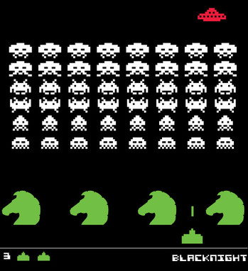
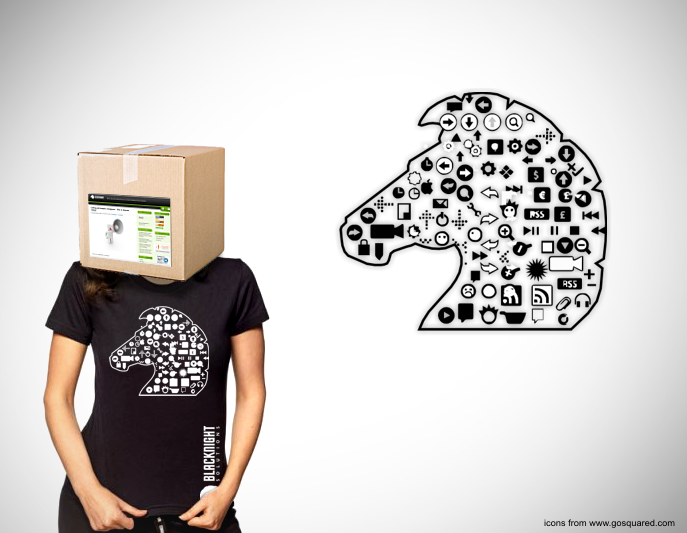
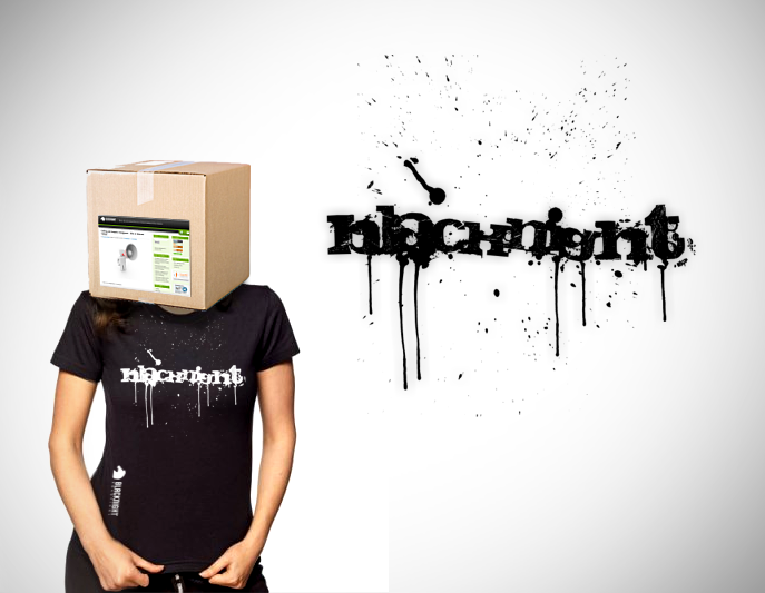
 John Braine came up with this one:
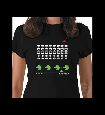
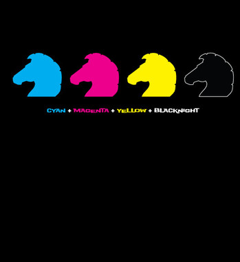
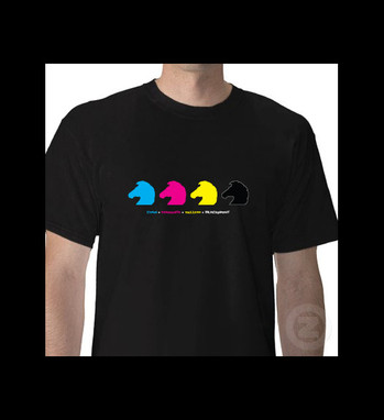
We’ve also received a couple of entries from people who didn’t include a link to their websites, so here is one we got:
 And another, this time from Aaron Quinn:
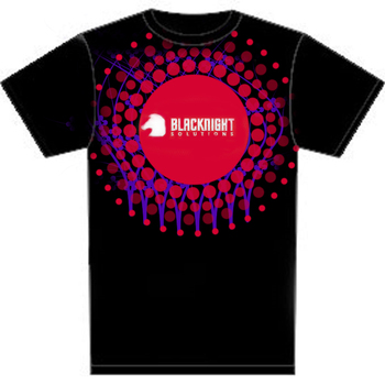 From another anonymous artist came:
 Keep the entries coming!
I’ll post a followup once I’ve got JPEG or PNG versions of some of the other entries we’ve got

Some really nice clever ideas, most are quite easy to re-produce also. Best of luck to all who entered.
Doreen
Would any of them be hard to reproduce on tshirts?
Michele
… without pinpointing
….designs with a lot of colour with gradient tones will be more difficult to produce than flat solid tones— while not impossible it is more costly.(you are likely looking at 4 colour sceen printing)
Designs that are quite large and sometimes run right out to the seams of the garment — while not impossible you are looking more at screen printing material before reproducing T-shirt. This is a costly and not really a practicable option.
In my opinion most t-shirt designs work best in one or two colours. I guess it is a similar principle of designing a logo or anything else for that matter — keep it simple, get the basics right and only then enrich… let it evolve …I think good design has been given a chance to develop, it has a certain credibility and honesty.
But it is worth noting that any of the designs above could easily be developed further to making reproduction simpler. Whether it is just by reducing size of design…. simplifying colour count …etc.
Did you receive my entry, I emailed management@ ? And when will the winner be announced ? This/next week ?
Paul
Paul
We got your entry – thanks
I am hoping to put up another blog post here with some of the other entries and then make a decision at some point next week
Michele
Here is a link to my entries
http://www.facebook.com/album.php?aid=1211&id=1674526810&l=ad8f143100
Hi Doreen1,
Loving this : http://www.facebook.com/photo.php?pid=16247&id=1674526810&l=ad8f143100 .
Any chance you can make the horse head inside a proper ” @ ” ?
Cheers,
Raul.
Hi Raul,
Thanks for your comments. I’ve took on board what you said. I’ve uploaded a couple of more options on that idea but I think this one works best for me.
http://www.facebook.com/photo.php?pid=19880&id=1674526810&l=ad8f143100
Doreen1,
Yes, love it, thank you ! 🙂
Good luck on the competition !
No really ‘thank you’. Your comments helped in ‘seeing the wood from the trees’…. I am glad you liked it. Besides whichever T-shirt design wins, I think we all deserve a T-shirt for our efforts…wink wink, nudge nudge
Some nice designs here…
I have uploaded mine to:
http://www.nicecubedesign.com/blacknight-tee.html
Paul
Another design uploaded to http://www.nicecubedesign.com/blacknight-tee-shadow.html
Paul
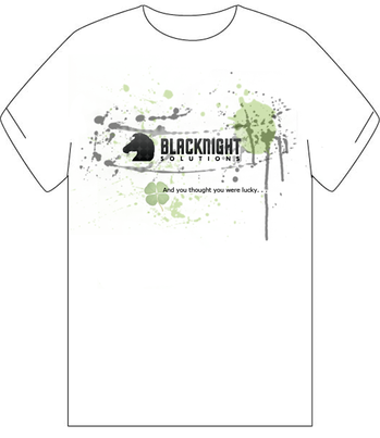
Sorry about not leaving a link back to my website. Just recently started my portfolio, and I’m still designing it, however it’s online. My design is the one that you posted with the four-leaf clover that states “and you thought you were lucky…”
3rd design uploaded to http://www.nicecubedesign.com/blacknight-rock.html
Paul
Who won?
Aaron
We haven’t chosen a winner yet
Michele
okay thanks!